Project Details
SERVICES
UX Design
Branding
Web Design
CLIENT
BrainStation (Academic)
DURATION
10 weeks
ROLE
Sole Contributor (Design)
TOOLS USED
Figma
Adobe Illustrator
Adobe Photoshop
Project Inspiration
Embarking on an adventure
Two days before their rental lease ended, a friend asked me for help with moving. As the only friend in their circle who was available and had access to a car, we spent several late nights working while swapping horror stories about renting and moving.
The last-minute scramble opened my eyes to the challenges of moving within Vancouver, and it made me wonder: “Can design make moving easier?”
Problem Space
Surveying the landscape
Every year, 2.1 million Canadian households relocate within 2 years,¹ but finding a reliable mover to help is a major obstacle: as the moving industry is federally unregulated,² Canadians are left to figure out everything on their own, like navigating inconsistent pricing standards and avoiding moving scams.
57% (1.2 million) of relocating households are renters,¹ who are more likely to experience unexpected moves and face these challenges more frequently.
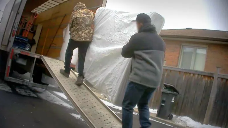
CBC Marketplace’s 2022 undercover investigation on common moving scams in Ontario (Source: CBC News)
With these insights in mind,
How Might We…
…help renters in Greater Vancouver plan their upcoming move so they can successfully relocate without trouble?
User Research
Encountering people along the way
Initial findings made me wonder if renters distrust movers, and if this bias might affect planning. To test my assumptions, I talked to renters who have hired movers in the past, targeting age demographics that make up the majority of the renting population (Millennials)⁵ or younger.
Research Hypothesis
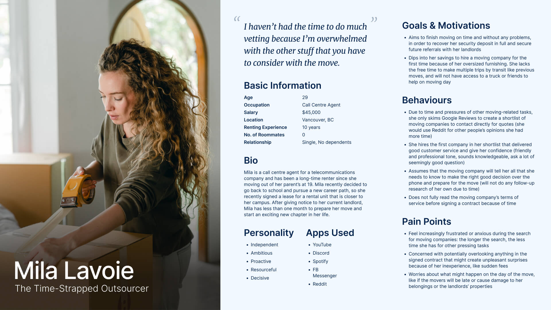
I believe renters spend a lot of time vetting movers due to mistrust, obstructing the planning process and even missing deadlines.
I will know this is true if interviewees share stories or opinions about their lack of trust in movers, and attribute them to their planning challenges.
Research Method
4 decontextualized interviews with residents in Greater Vancouver:
- Ages 19 to 39
- Owns a smartphone
- Renting or rented in Greater Vancouver in the last 5 years
- Hired a mover within the last 5 years
Research Findings
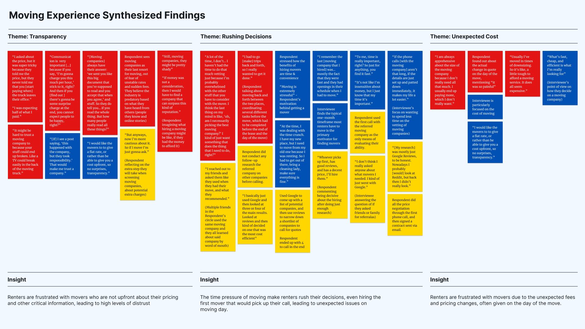
The interview findings revealed that my assumptions were incorrect: renters who already decided to hire help will quickly find a mover and readily trust them.
Instead, findings reveal an opposite set of behaviours that prioritizes expediency over caution, going against expert advice of getting estimates from at least 3 movers before making a decision.⁶
“I haven’t had the time to do much vetting because I’m overwhelmed with the other stuff you have to consider with the move.”
— interviewee #4
Rushing Decisions
The pressure to move out on time forces renters to rush decisions, leading to oversights on moving day.
Conflicting Behaviours
Renters might take many risks while overlooking or ignoring their concerns if it means saving time.
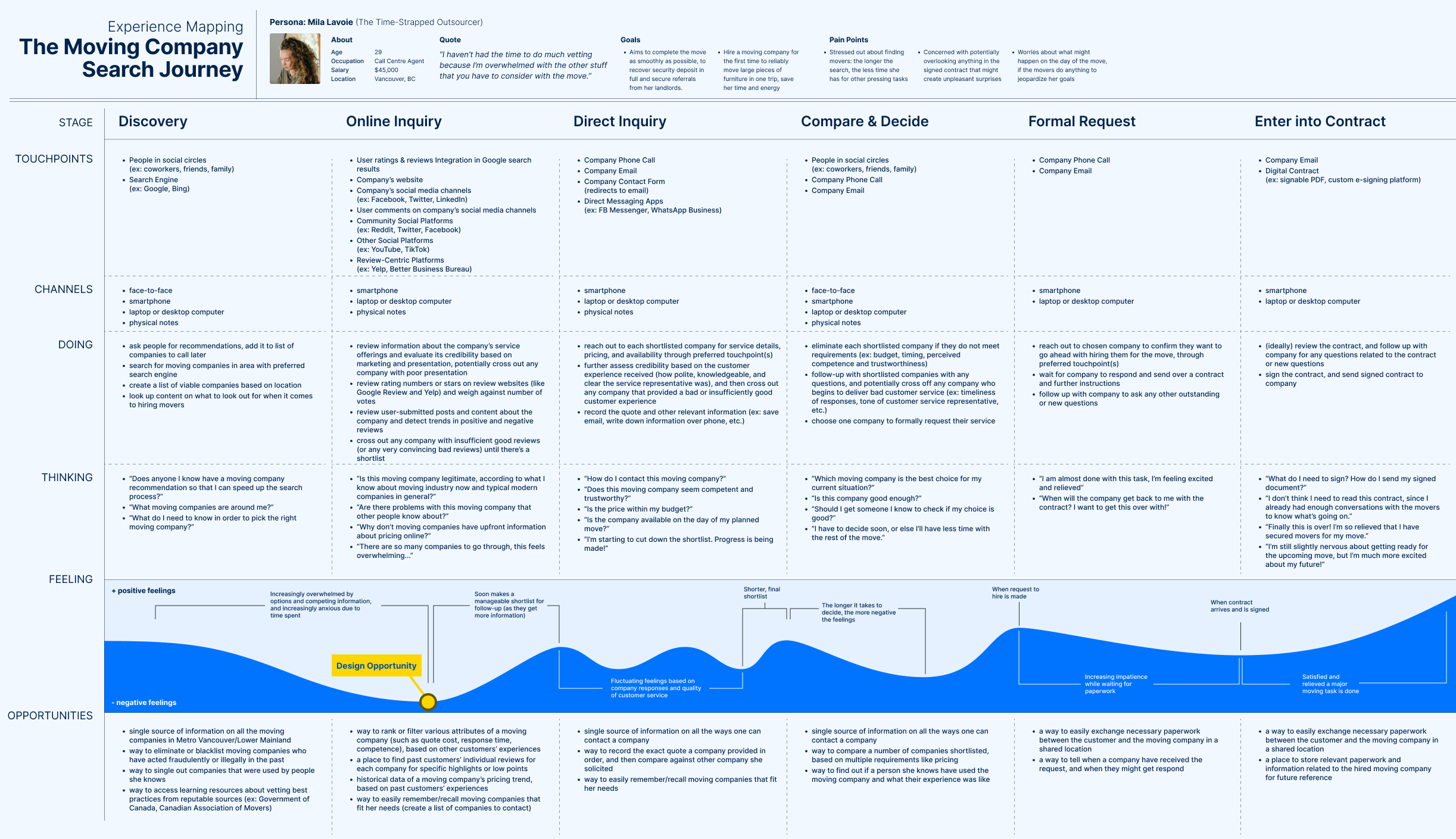
Moment of Opportunity
Addressing the initial search phase for movers has the greatest positive impact on renters.
As a result, I revised the question to:
How Might We…
…help renters in Greater Vancouver efficiently find reputable movers, saving time and reducing anxiety during the moving process?
Defining Requirements
Charting the course toward a solution
While researching for search solutions, I discovered Prudential’s Map My Retirement, a questionnaire that matches people with places in the U.S. tailored to their ideal retirement lifestyle.
This inspired the idea to pursue a “trusted advisor” questionnaire experience to supplement a traditional search experience as if a renter is reaching out to an expert for a shortlist of movers based on the needs of their upcoming move. It can be framed like so:

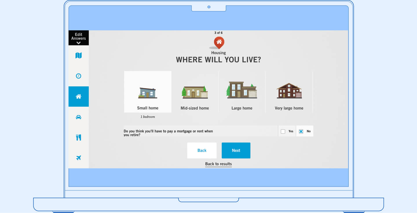
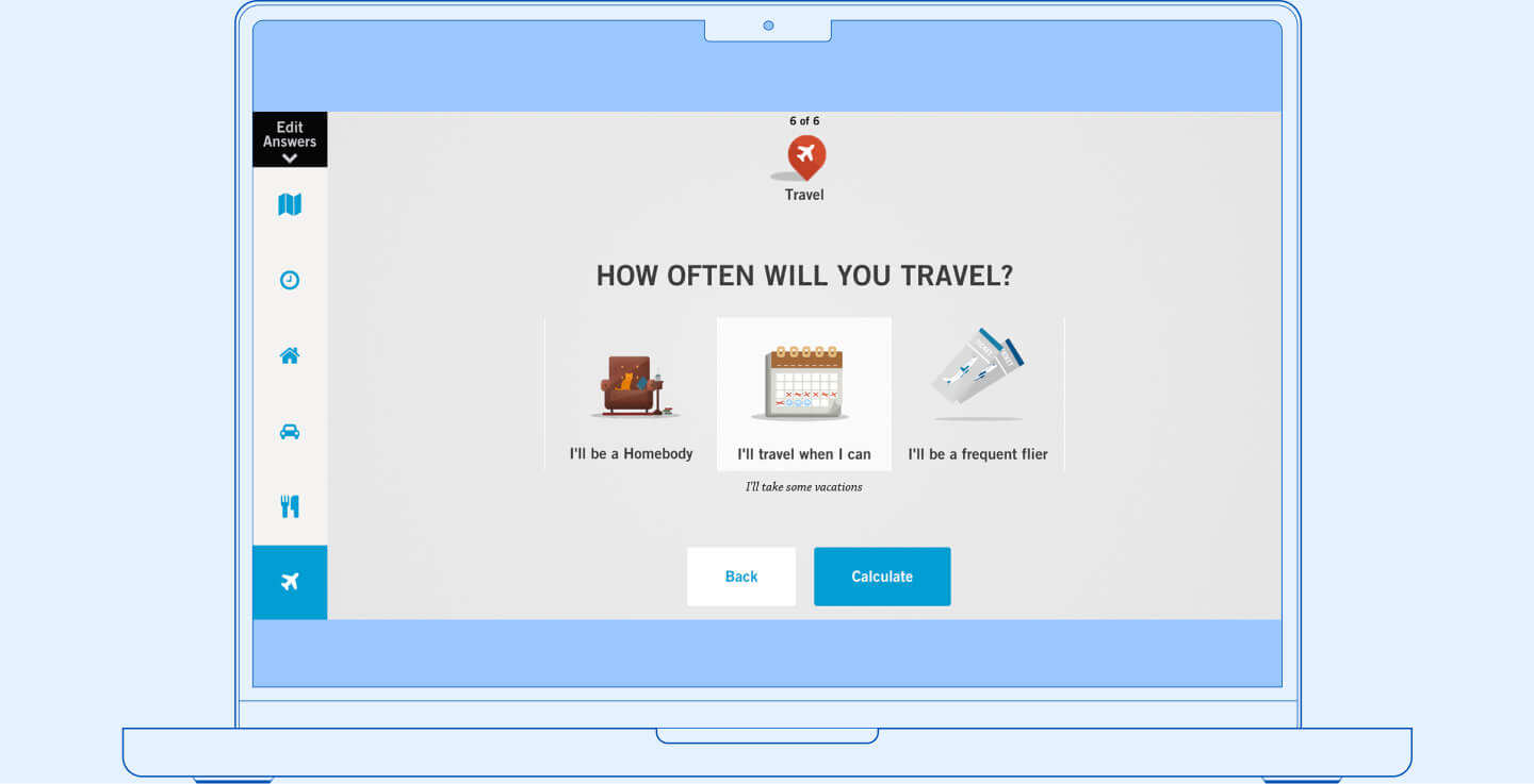
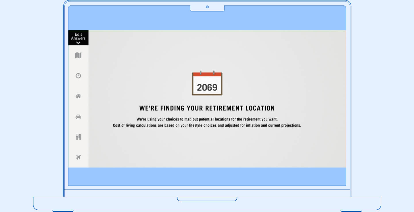
Select screens from Prudential’s Map My Retirement tool
Design Hypothesis
I believe the “trusted advisor” questionnaire is the ideal search method for renters who are unfamiliar with the moving industry and short on time to conduct thorough research.
I will know this is true when renters spend less time searching for movers by 25% and the rate of successful matches with movers increases by 20%.
Measure of Success
Time: amount of time to decide on one or more movers that meets a set of requirements.
Match Rate: rate of users entering service agreements with the movers they find through the search method.
Requirements and Constraints
With the idea in place, I began defining the solution further to align with research findings. The solution would be an all-in-one tool for moving, while the questionnaire concept would be a key part of the solution, addressing a specific moving problem.
To tackle the issue of finding reliable movers, I decided to source movers listed with the Better Business Bureau (BBB) and the Canadian Association of Movers (CAM), two organizations that accredit movers who meet their respective standards of ethical practice.
I also decided that the initial form of the solution will be a native mobile app, based on smartphone ownership trends of the target user group.⁷ iOS and Android both have significant market shares (59% and 41% respectively),⁸ so decisions were based on capabilities and design patterns that are found in both platforms.
CAM issue memberships to movers who commit to their rules of ethics, while BBB grades all of their listed companies and document complaints from customers.
Drafting Feature Sets
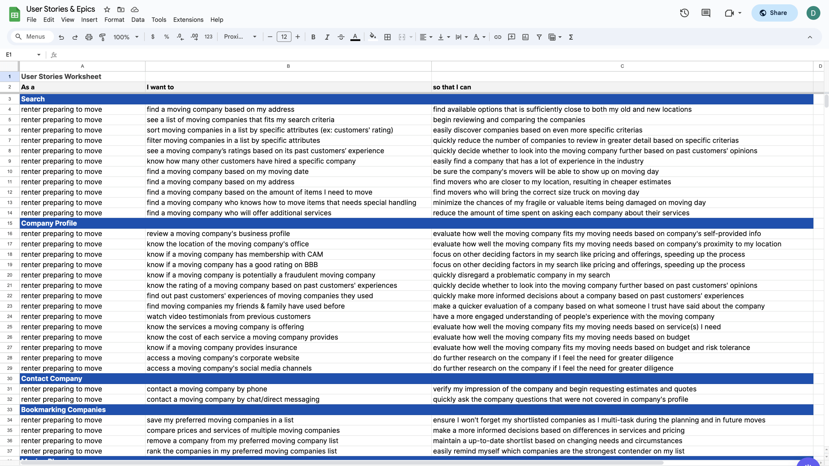
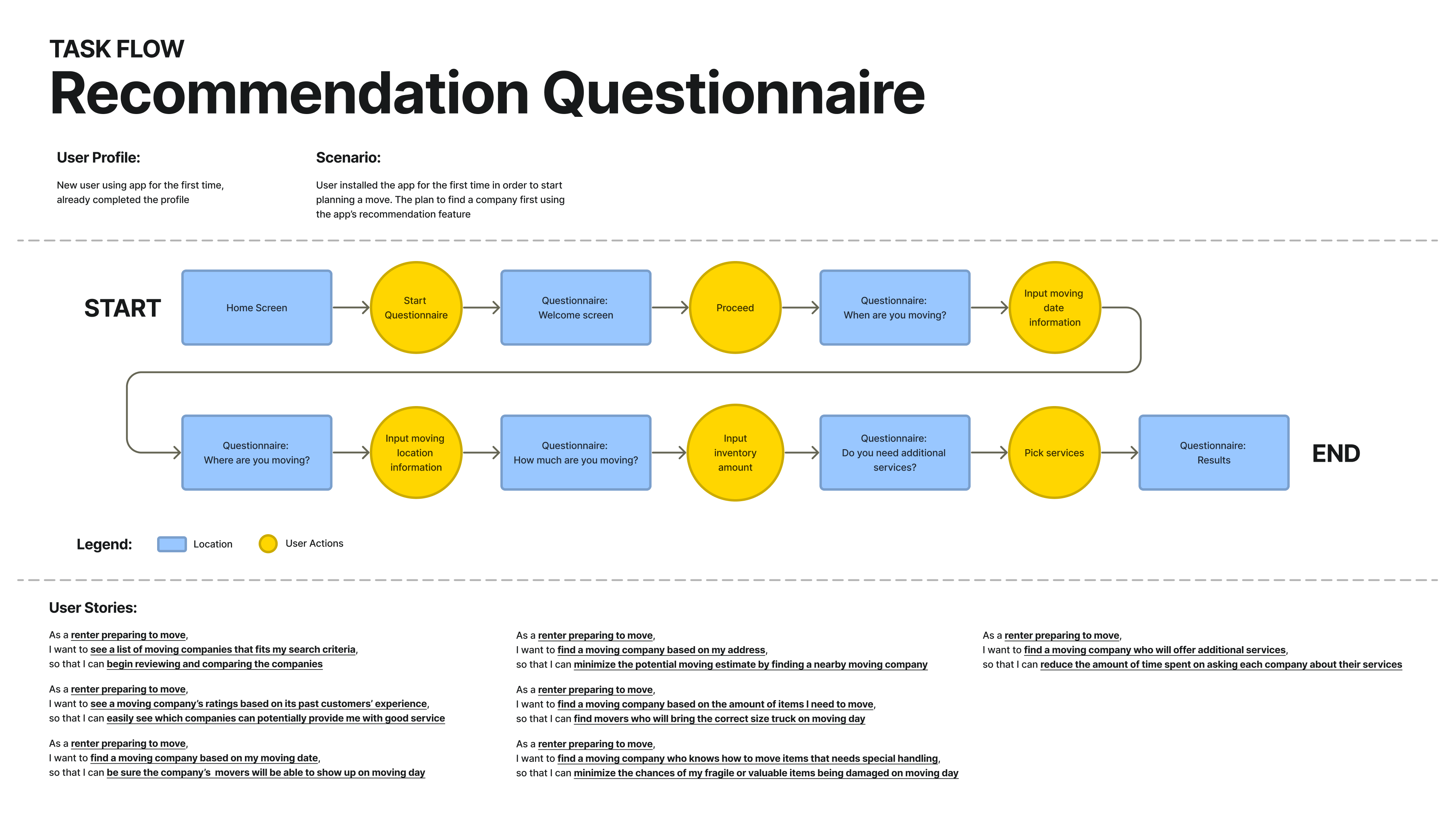
Identified features for the Search epic that promoted efficiency in reviewing & comparing movers.
Pacing the Experience
Defined each screen based on research findings about moving and other mobile app conventions.
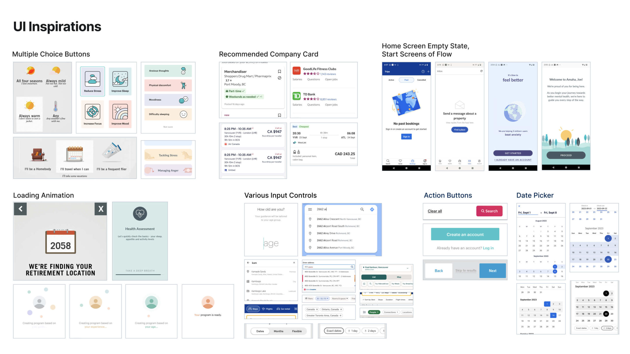
Finding Inspirations
Collected samples of effective inputs & controls targeting users’ digital usage behaviours.
Ideating, Prototyping & Testing
Driving ahead with iterative problem-solving
In this phase, I engaged in an iterative process of generating, testing and improving ideas based on established constraints to develop a proof of concept that prioritizes usability. I used Figma to implement the ideas and a moderately older smartphone for testing (Google Pixel 6, Android 13).
I also planned two rounds of user tests with iOS & Android smartphone owners ages 19–39 (8 testers total, 4 testers per round) to validate the “trusted advisor” search model and detect general usability issues.
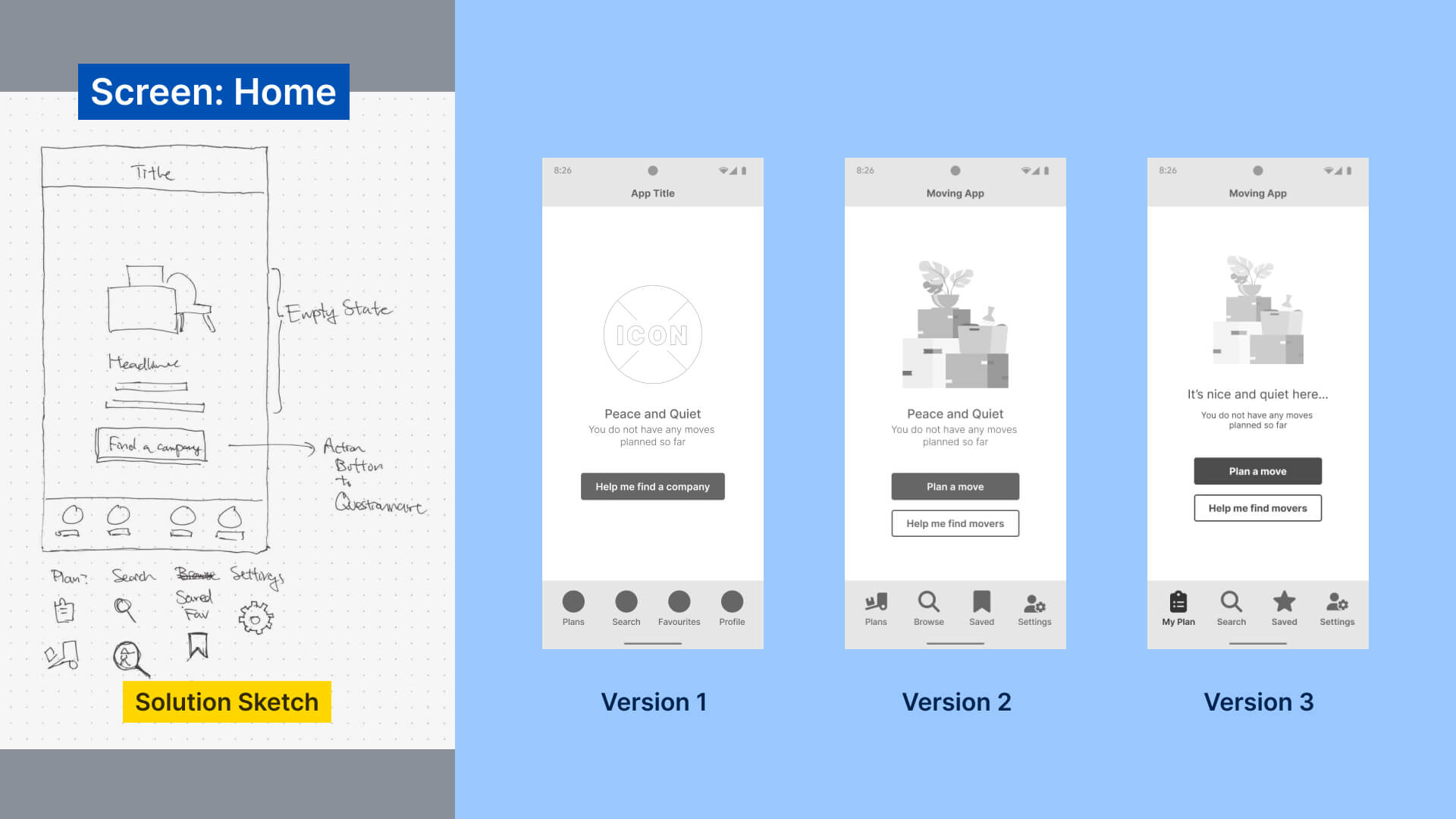
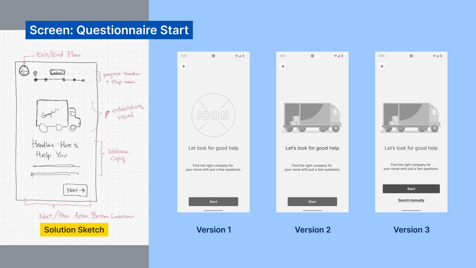
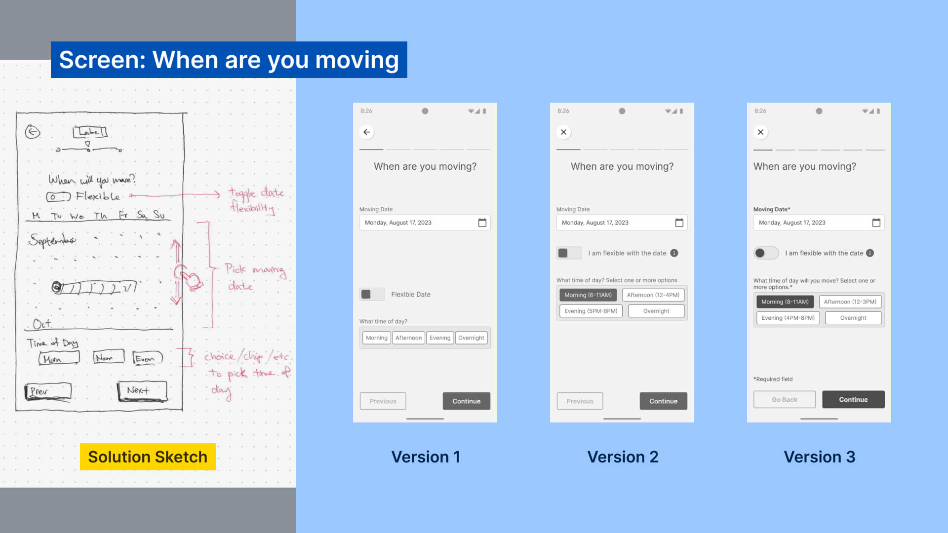
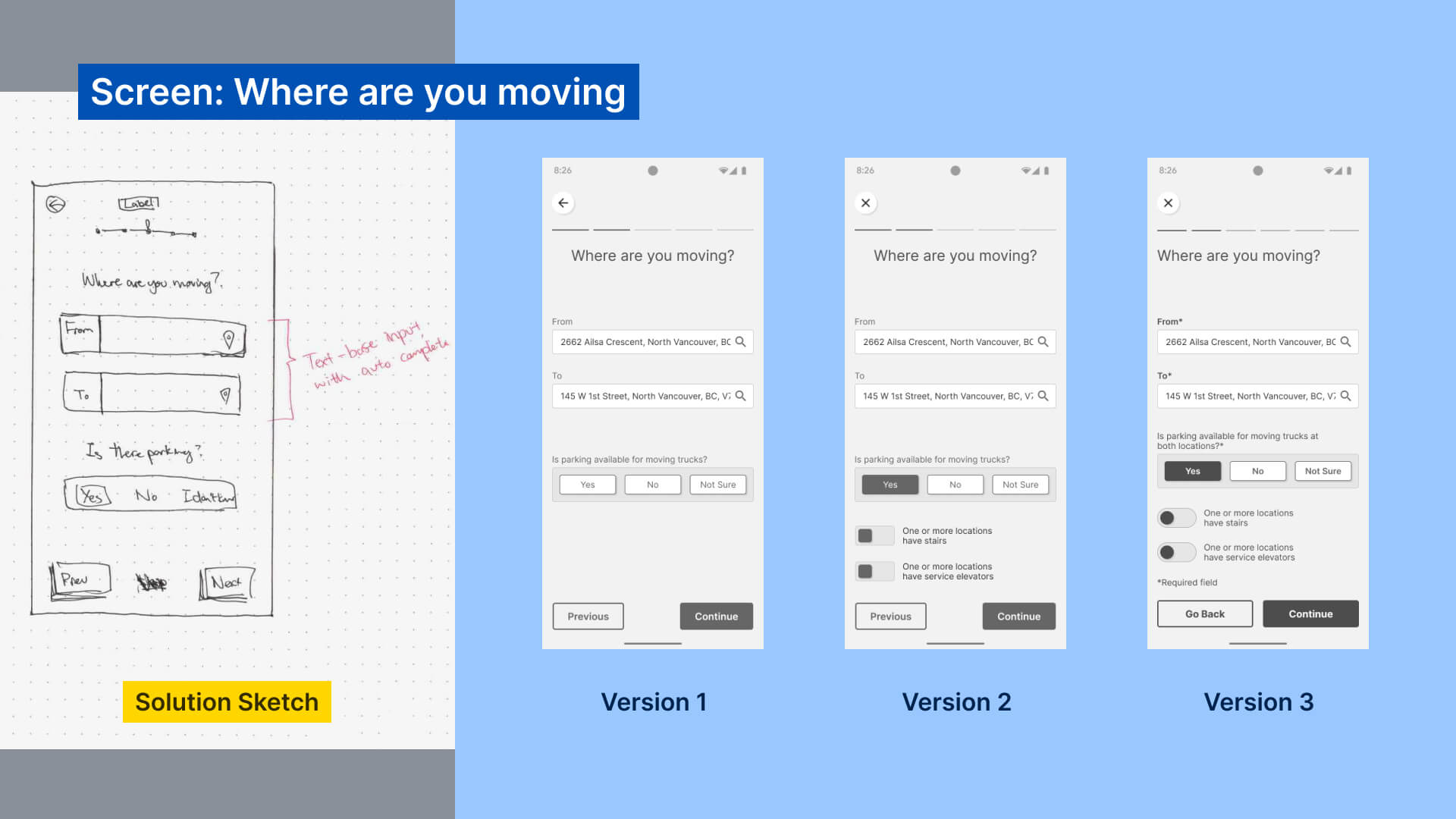
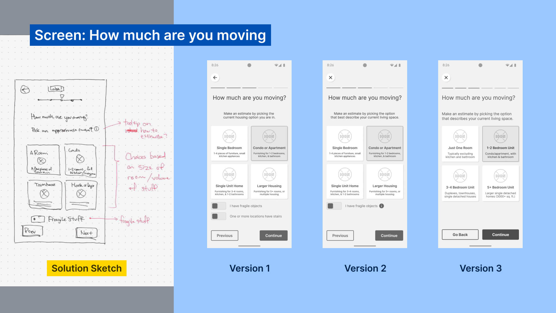
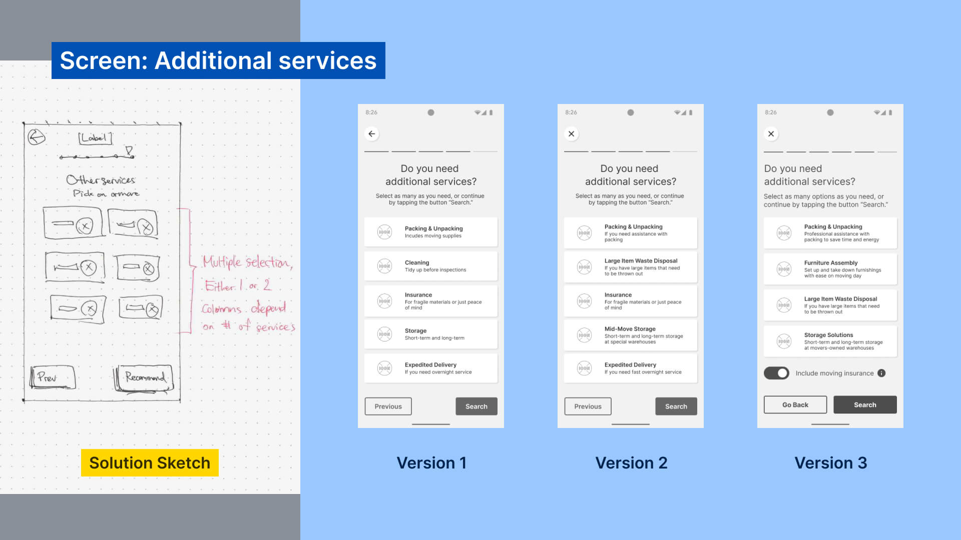
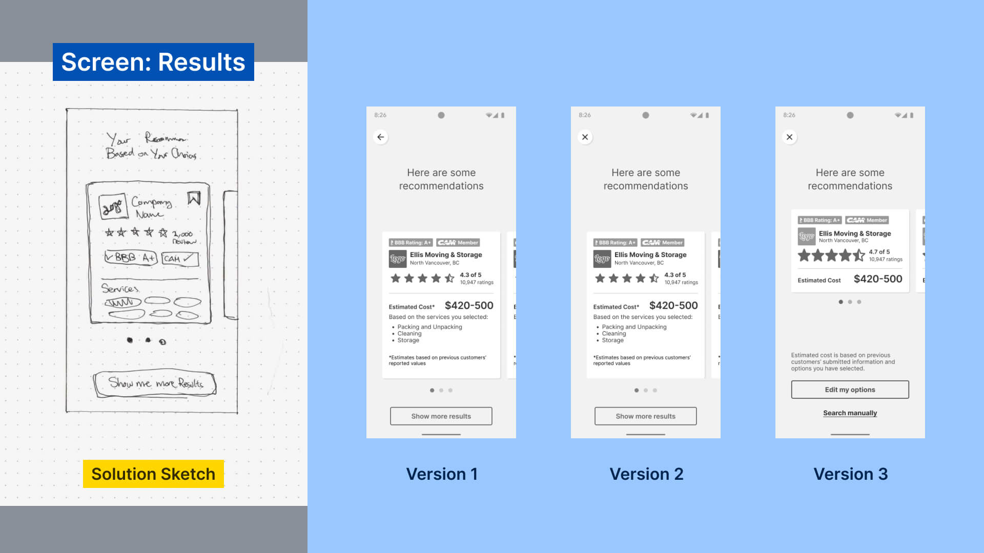
Sketches & iterated wireframes for each screen
Test Results
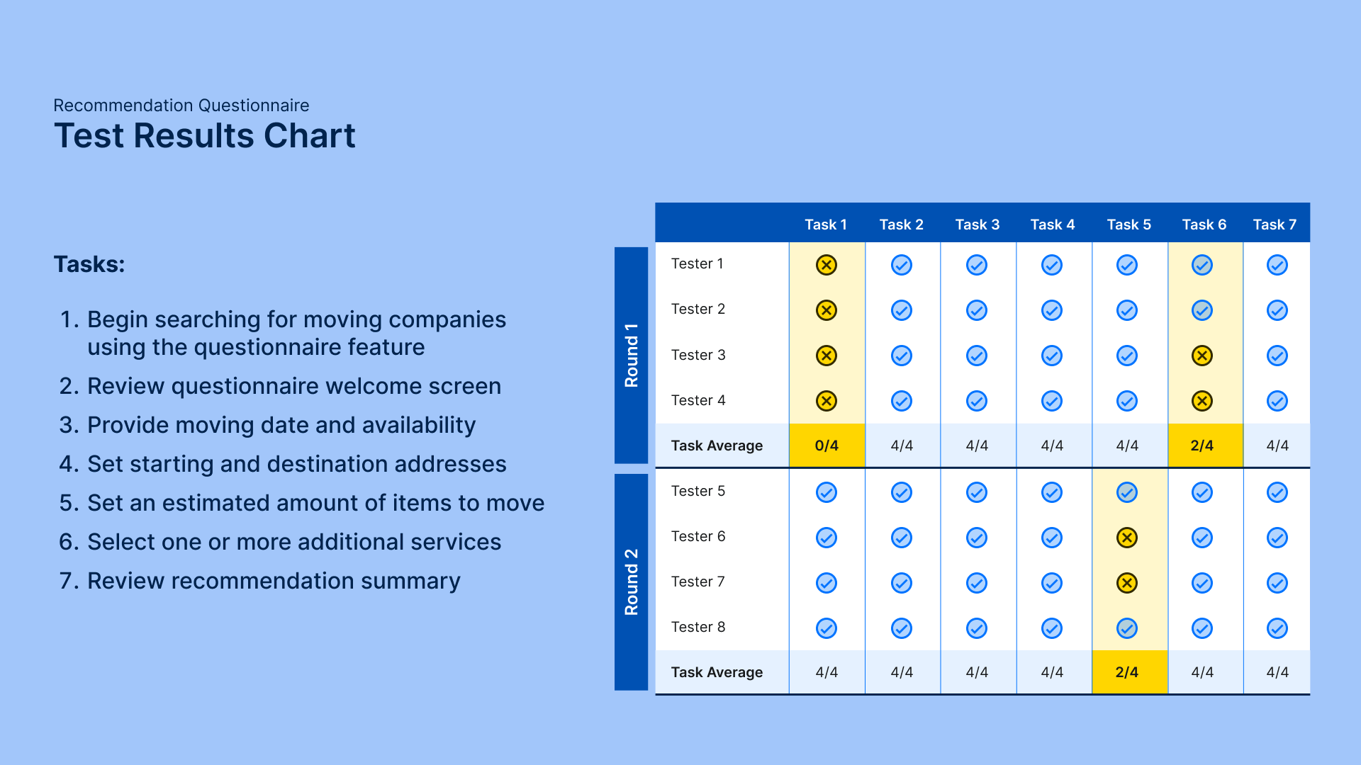
Through testing, 100% of testers confirmed the search method’s positive value on future moves, identified through unprompted responses from testers during their respective sessions.
As for usability, testing revealed 3 main issues:
Declaring Items for Special Handling
Originally only had one toggle to declare fragile items. Resolved by creating an additional screen with more options.
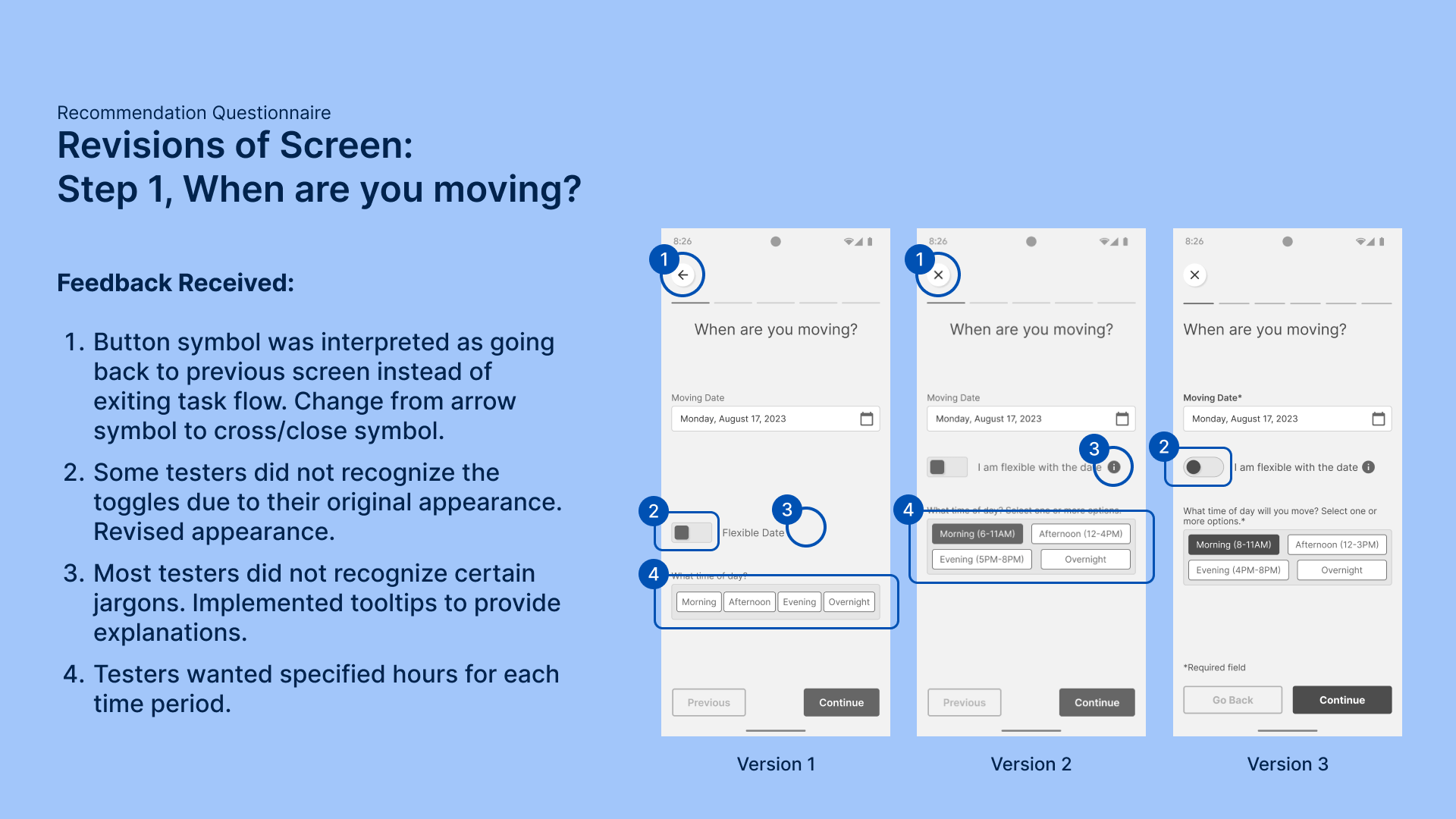
Unfamiliar Look & Feel of Toggles
Originally had rectangular features, which some testers thought were static decorations. Resolved by redesigning the toggles.
Jargons and Confusing Choice of Words & Icons
Resolved by updating copy and icons for clarity, and added a tooltip feature to explain industry lingo when they are used.
Brand Development
Envisioning the view around the bend
Before finalizing the prototype to high fidelity, I conducted a visual branding exercise to direct upcoming UI decisions like colour injections and animation style.
All choices made were tested against the following question: “If the app was a person, how would it look and behave to help frustrated renters feel at ease?”
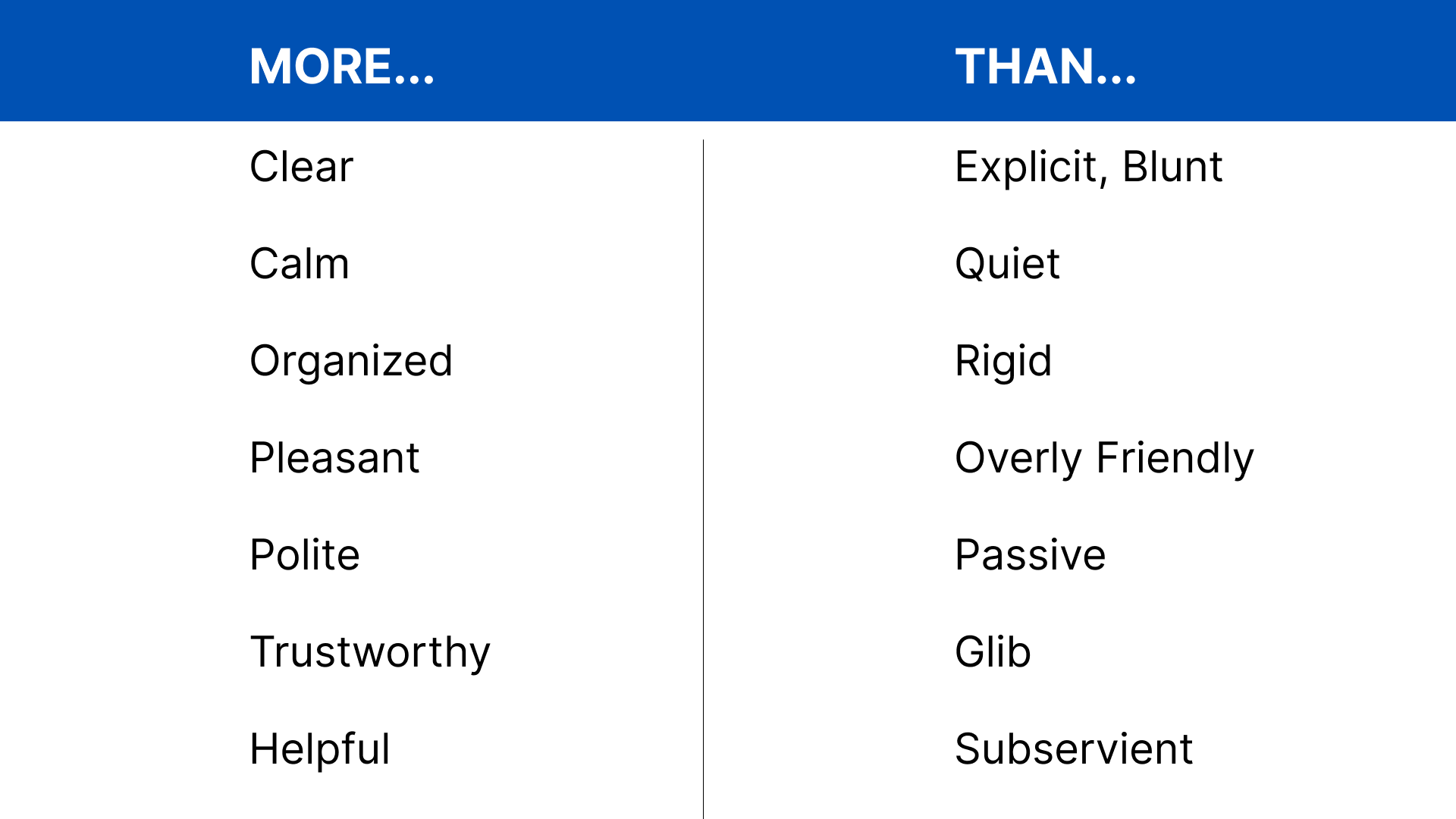
A Word Picture
Focused the branding exercise with adjectives that invoke the image of the “trusted advisor.”
Abstract Inspirations
Curated abstract imagery aligned with the key adjectives to guide design decisions.
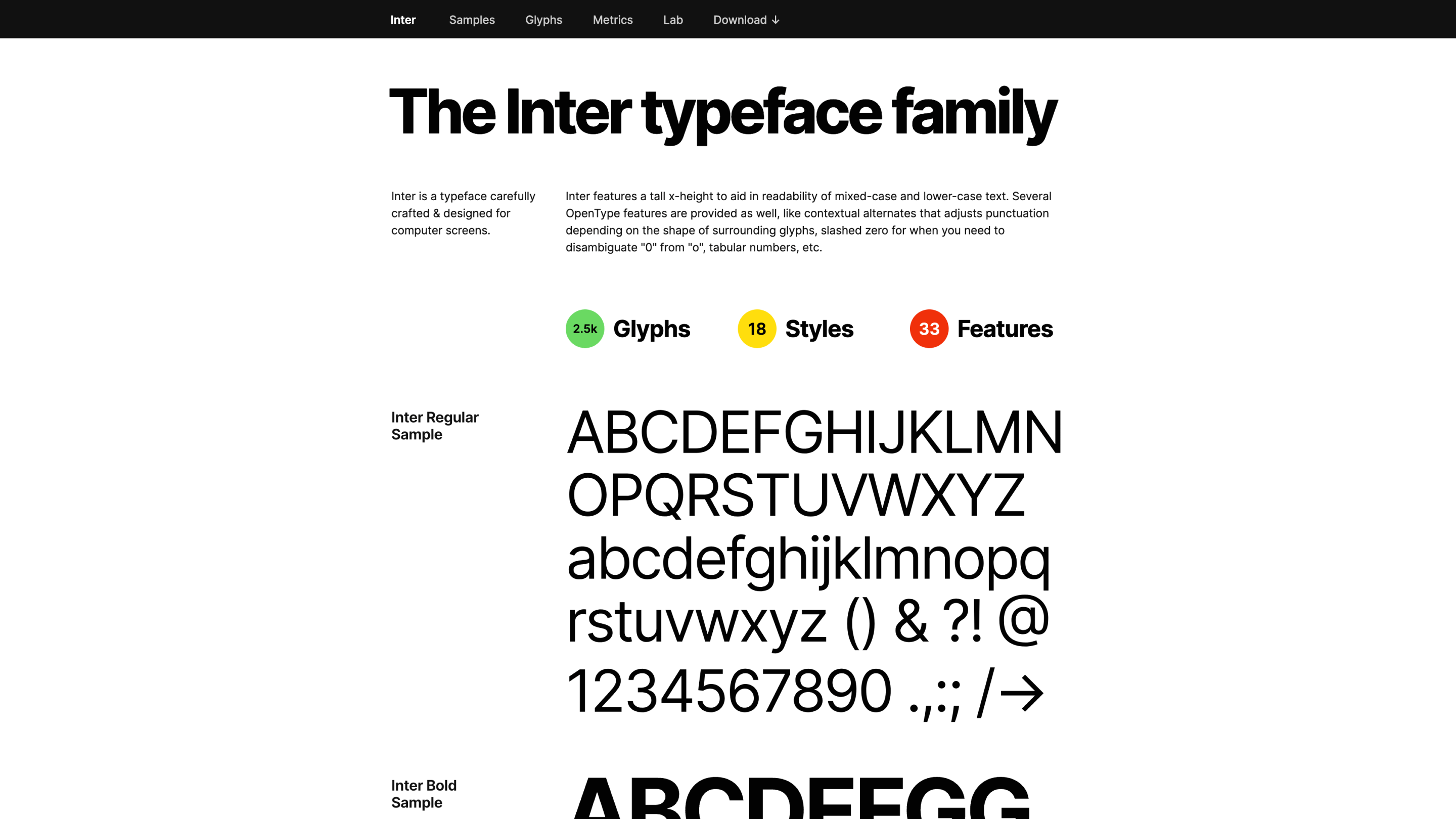
A Trustworthy Voice
Selected one neutral and readable sans serif to support the brand’s tone of voice.
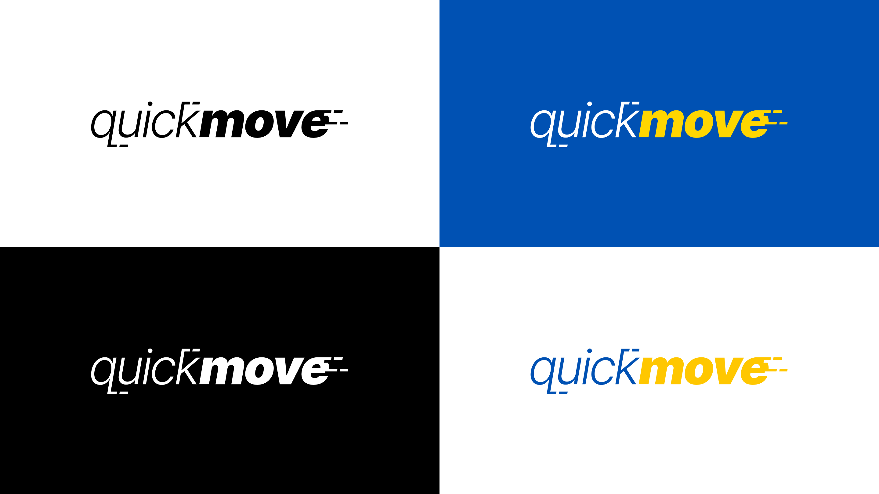
With the name of the app, I brainstormed ideas that directly convey the app’s basic value proposition with just words. The final candidate was “QuickMove,” a portmanteau of the core service users need and how that service will be delivered.
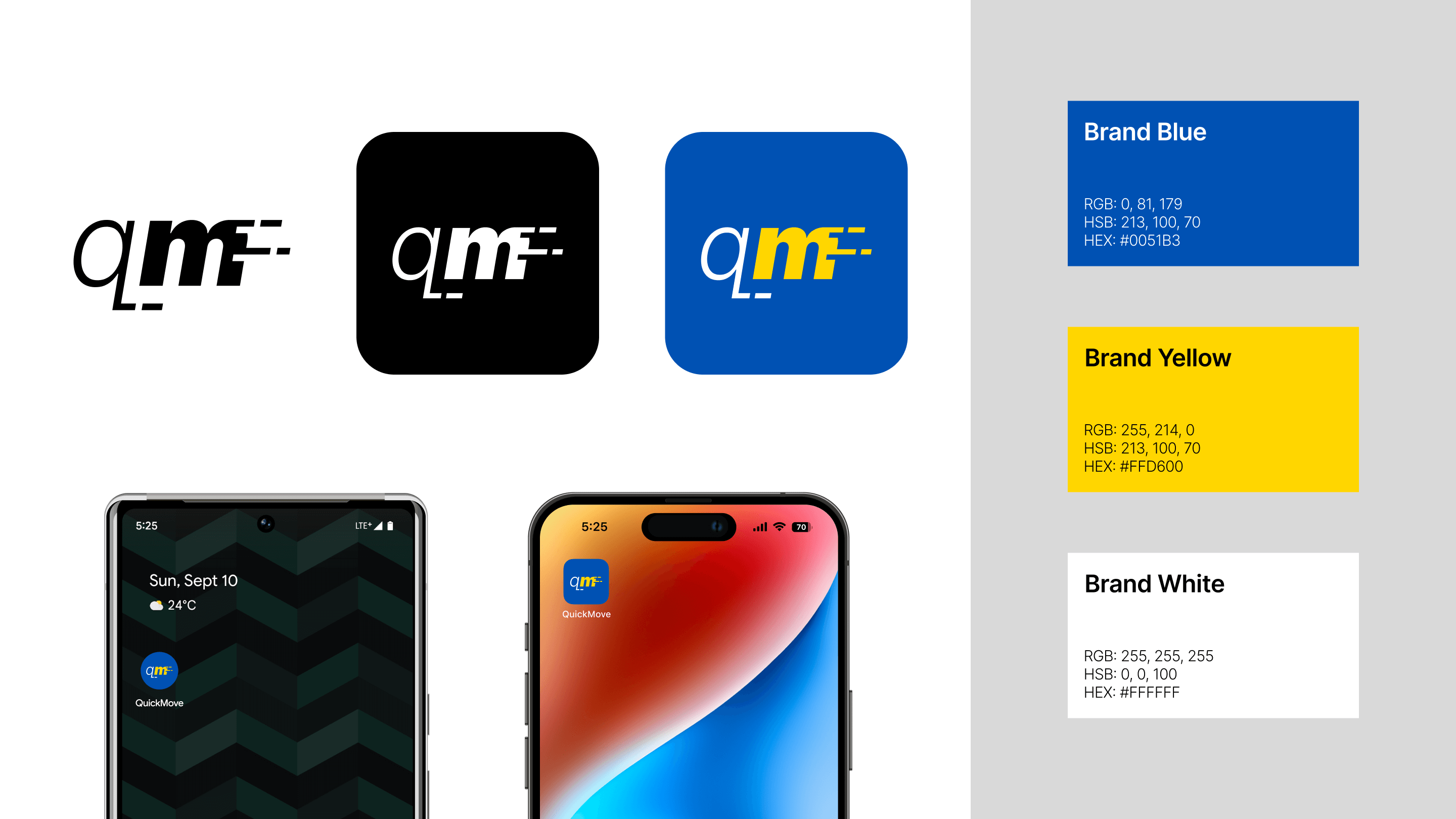
To complement the idea behind the name, I designed a standalone word mark with the brand typeface and injected graphical depictions of motion, as well as an alternative version that fits the square constraints of an app icon using the name’s initials.
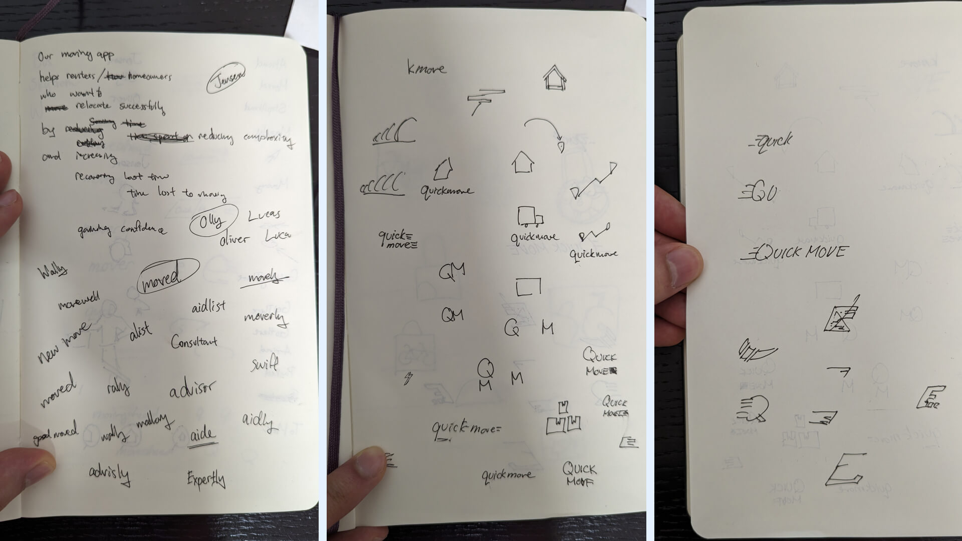
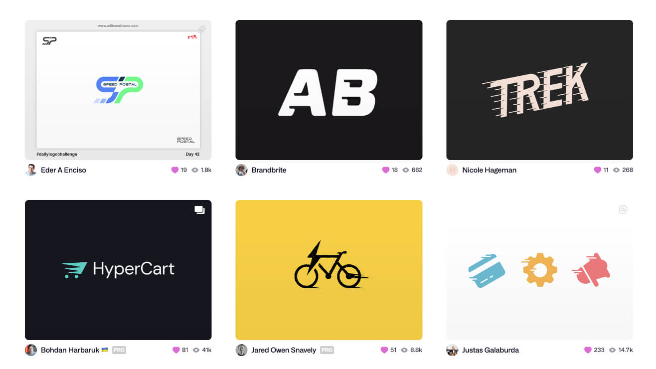
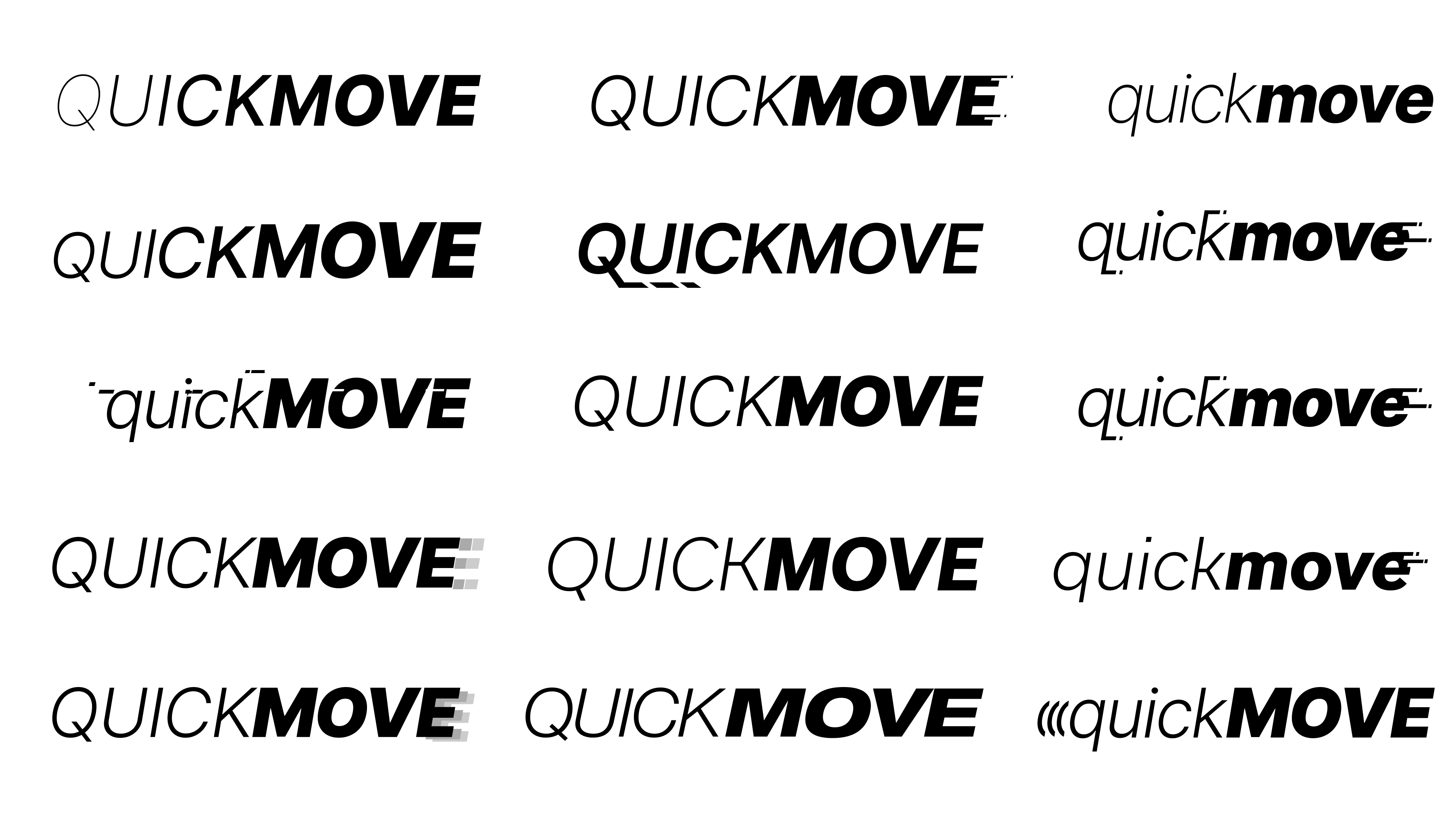
Brainstorming by hand, inspiration research (Dribbble), and digital mock-ups
High-Fidelity Prototype
Arriving at destination
Aligned with the decisions made in the branding exercise, I proceeded with the high-fidelity prototype of the app and documented all the UI decisions.
Prototype
UI Library
Browse using Left and Right Arrow keys via keyboard. Tap “R” to return to the first slide.
Marketing Website Development
Sharing the experience with others
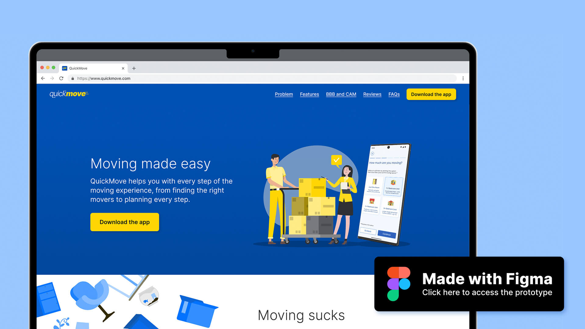
To support the distribution of the QuickMove app, I designed a responsive, one-page marketing website to maximize download conversion, using the guiding question: “How might we convince time-strapped visitors to download the QuickMove app for their upcoming move?”
I conducted a process similar to the branding exercise to produce a proof of concept that is consistent with the established QuickMove branding and explored existing UI patterns that would direct users to download the app with minimal friction.

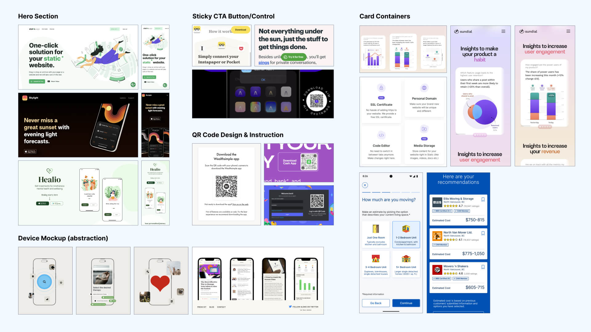
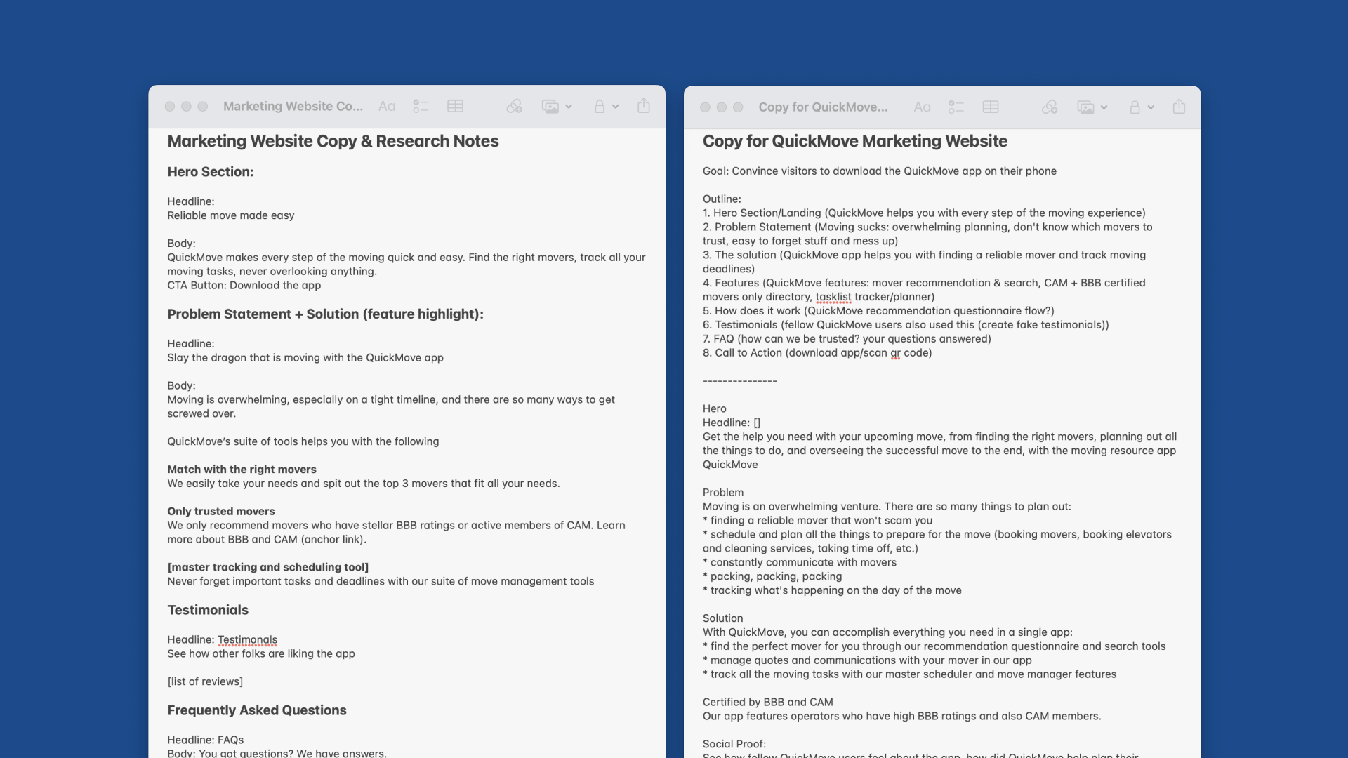
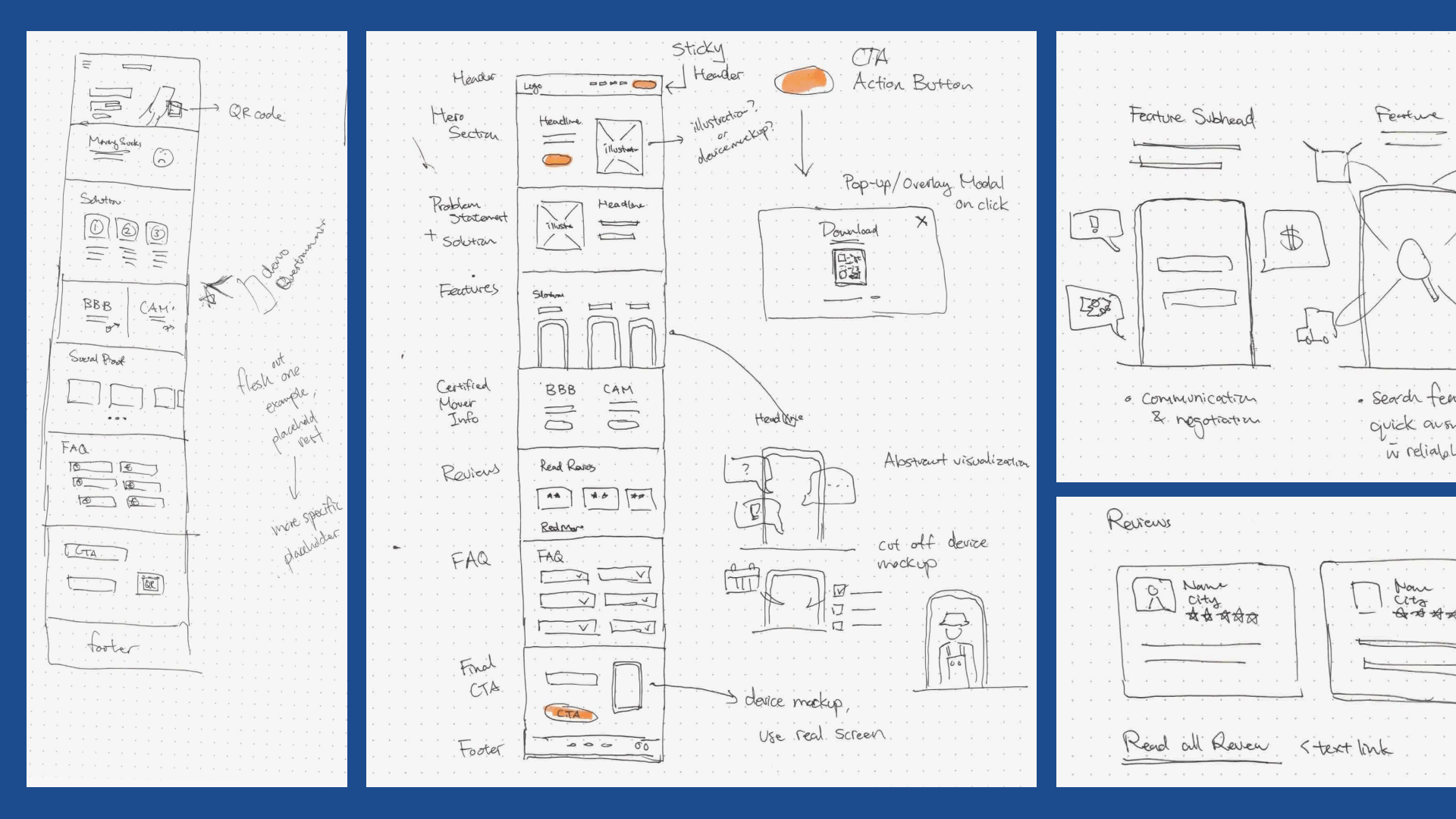
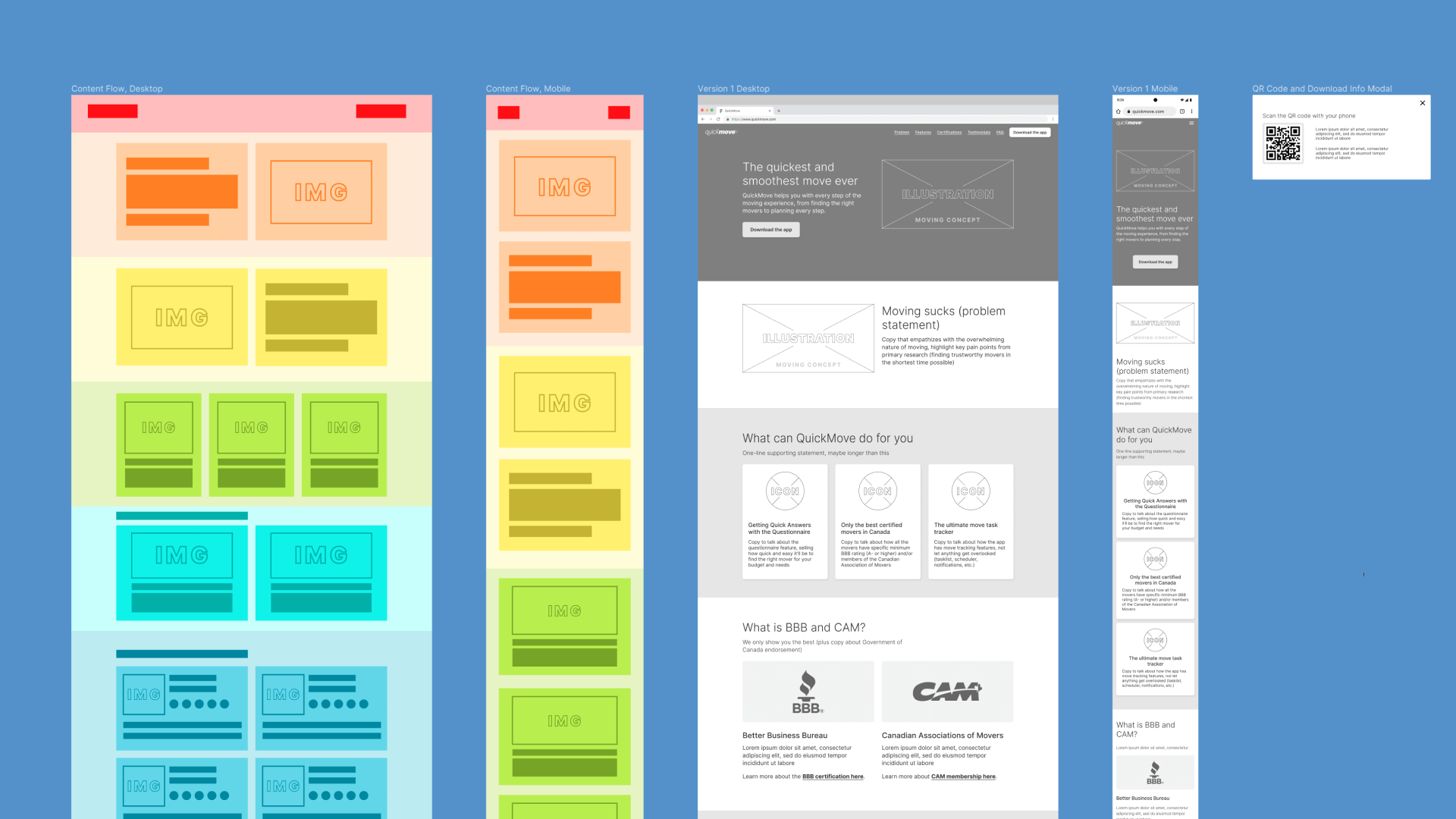
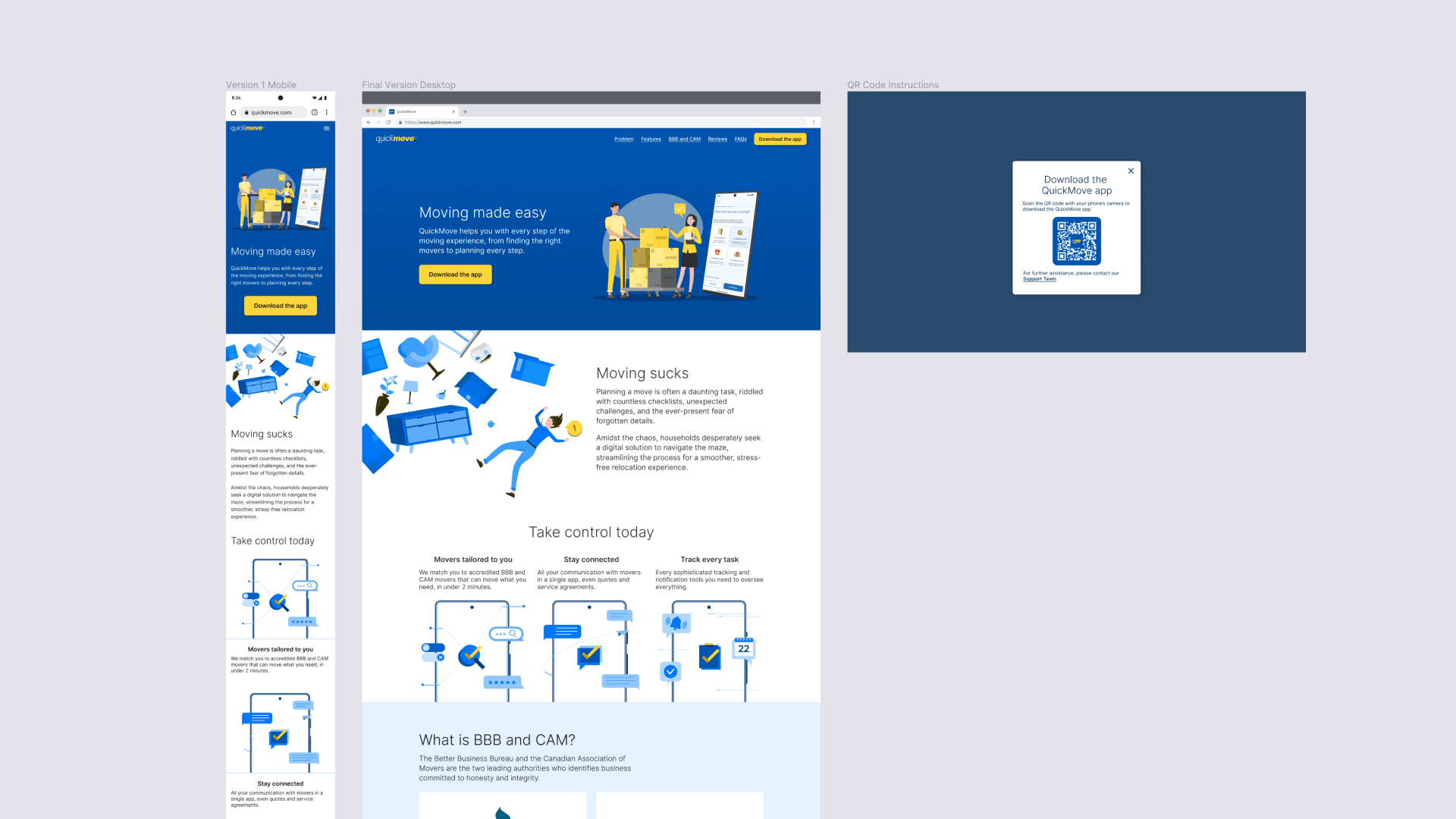
Mood boarding, UI pattern research, copywriting, sketching, content flow planning, and wireframing
Appendix
Documenting sources & assets
Citation Sources
- Canadians on the move. Statistics Canada. March 29, 2023.
- Planning a Move. Canadian Association of Movers. No date. Accessed October 11, 2023.
- Know Your Mover: BBB study reveals scammers price gouge, take belongings hostage and destroy goods. Better Business Bureau. June 30, 2020.
- Canadians warned to be aware of fly-by-night moving companies. Global News. May 10, 2022.
- To buy or to rent: The housing market continues to be reshaped by several factors as Canadians search for an affordable place to call home. Statistics Canada. September 21, 2022.
- Moving advice. Government of Canada. December 8, 2022.
- Canadians among global leaders in internet usage and smartphone ownership, Pew Research Center study shows. Canadian Wireless Telecommunications Association. January 19, 2023. Via Cision.
- Mobile Operating System Market Share in Canada - September 2023. Statcounter. No date. Accessed October 11, 2023.
Photography
- Persona: Concentrated young lady sealing cardboard boxes at home. Ketut Subiyanto. Via Pexels.
- Branding & Website Mood Boards:
- Pattern Collection by CodeinWP
- Same Energy
- SAVEE
- Unsplash
- Logo Inspiration via Dribbble:
- HyperCart, Bohdan Harbaruk
- Custom Speedy Font, Brandbrite
- Speedy Postal Logo, Eder A. Enciso
- Speedy, Jared Owen Snavely
- Speedy Icons, Justas Galaburda
- PLAYING WITH SPEED, Nicole Hageman
Illustrations & Icons
- In-App Icons:
- In-App Illustrations:
- House moving concept, Freepik, via Freepik
- Loaders carrying armchair and boxes in new house, pch.vector, via Freepik
- Two female friends meeting and chatting at home, pch.vector, via Freepik
- Family moving to new house, pch.vector, via Freepik
- Portfolio Website Icons & Illustrations:
- Website Mockup Illustrations
©️ David Ko 2023.
